CASE STUDY
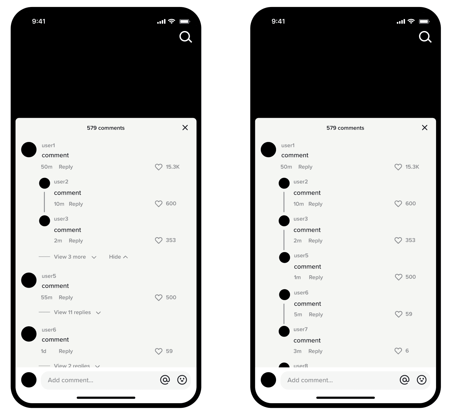
This project focuses on improving TikTok’s comment section, where users often find it difficult to recognize who is replying to whom. I redesigned the structure of the comment threads to create a clearer visual hierarchy and make reply chains easier to follow.
The Problem
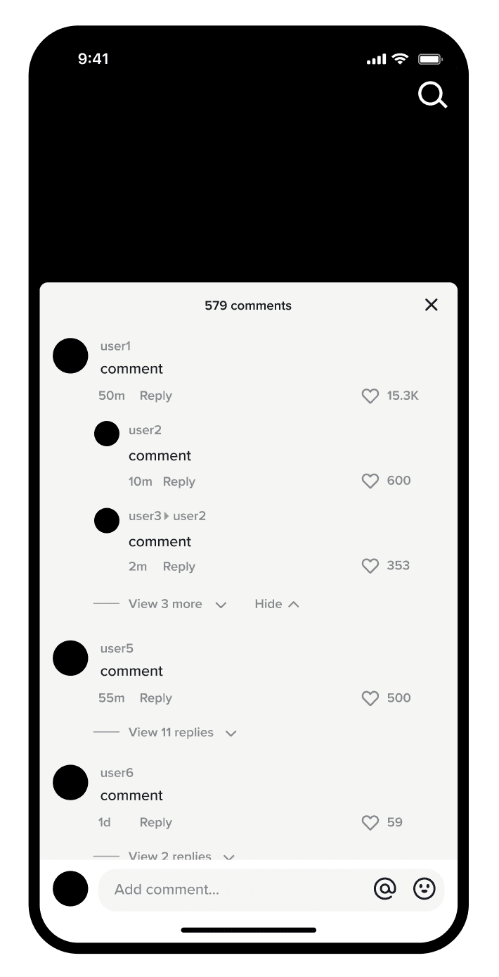
The current TikTok comment layout uses indentation and light grey text to indicate replies to comments, making it unclear which replies belong to which comment.
I separated the issue into three parts:
Structure: No visual connectors to imply relationships between comments.
Readability: Light grey, small text makes reply indicators easy to miss.
Design Exploration
To understand the issue more deeply and ideate a solution, I analyzed:
Multiple videos with long comment chains
User complaints on social media
Interaction patterns on competing platforms
As shown below, Instagram utilizes the same indentation that TikTok utilizes, but, when a user replies to another comment, the original commenter's username is highlighted blue and can be found at the beginning of the comment. Although this feature makes it easier to determine who is replying to whom, I was more interested in creating a visual cue to indicate the relationship between comments because TikTok is a platform on which more users engage through comments than Instagram.
X
YouTube
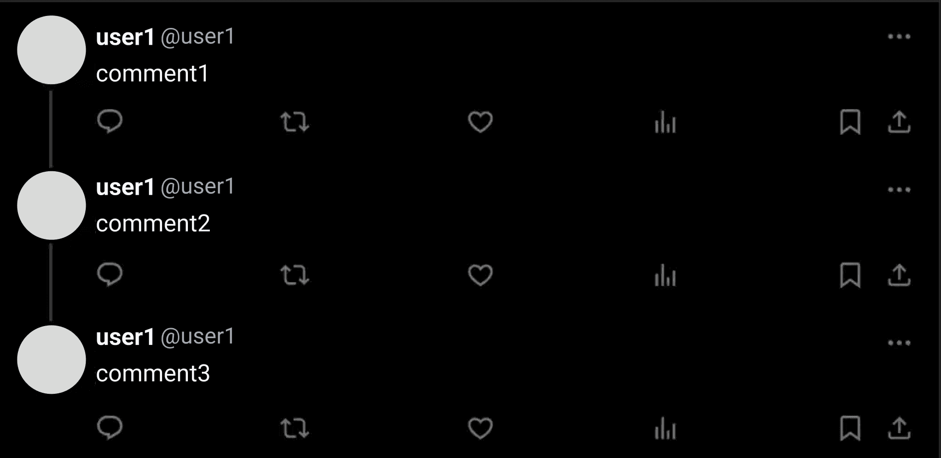
X and YouTube utilize connecting lines between comments to indicate who is replying to what, from which I took inspiration for my final iteration. On X and YouTube, however, usernames are closely associated with users, whereas on TikTok, only the names set by users are seen in posts or in current comment sections, so the usernames were not integrated into my iteration of TikTok's comment section. On X, each comment can be opened in a new screen, and, on YouTube, multiple lines indicate different comment threads. These could be overwhelming on TikTok's comment section, which is already a pop-up, so only lines connecting replies to original comments were added into my final iteration.
Conclusion
My final design removed the triangle that indicated which user was replying to which user and replaced it with direct thread connections between comments using vertical lines. The end result is a much more intuitive comment system, helping users understand conversations at a glance for multi-personal interactions while staying true to TikTok’s simple visual language.


